welcome to canada. branding the interchurch refugee group.
in 2014 i was hired pro-bono, by the interchurch refugee group to create an identity for them, in celebration of their 20th year as a not-for-profit organization. the brief was simple- an image so easy to understand, it didn’t require words.
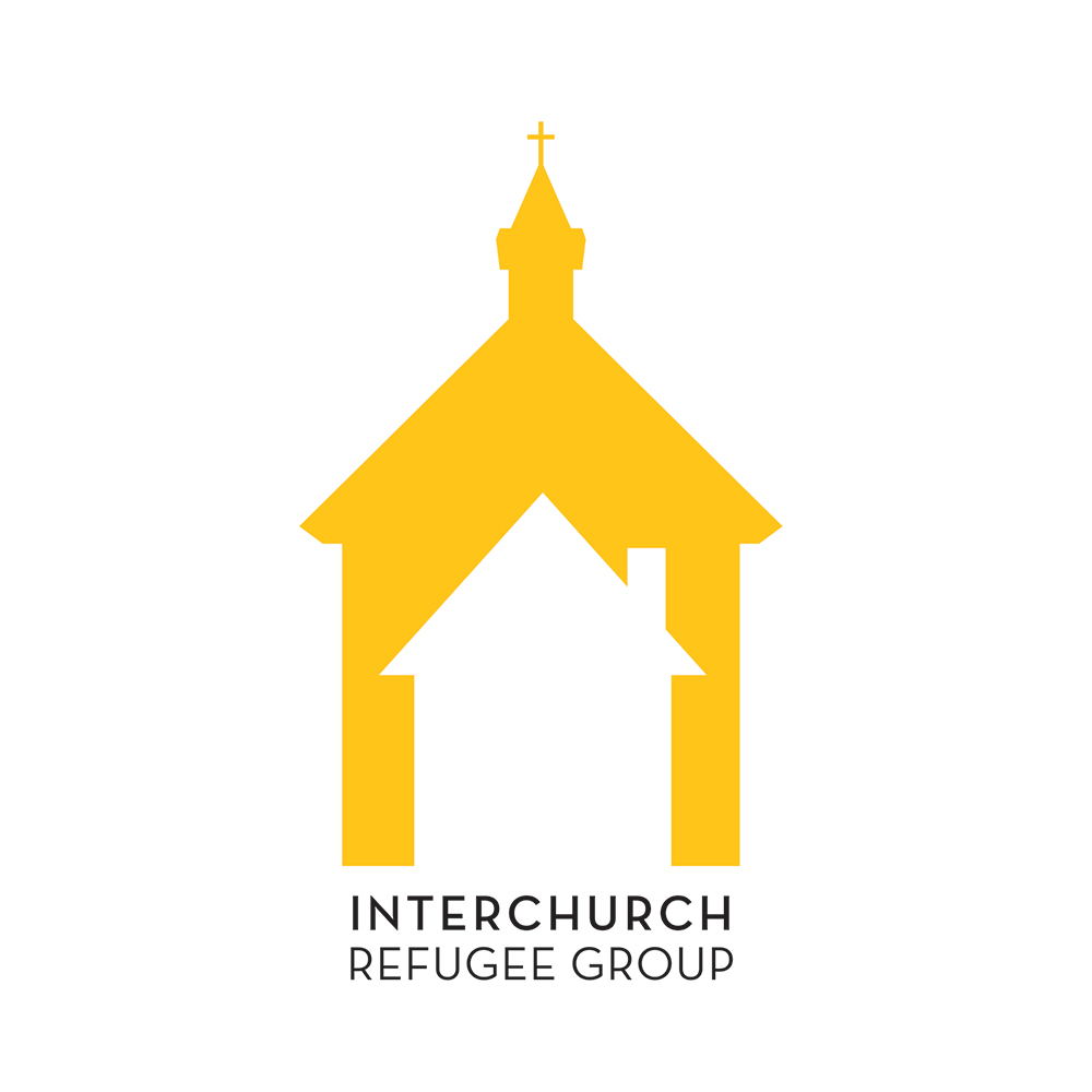
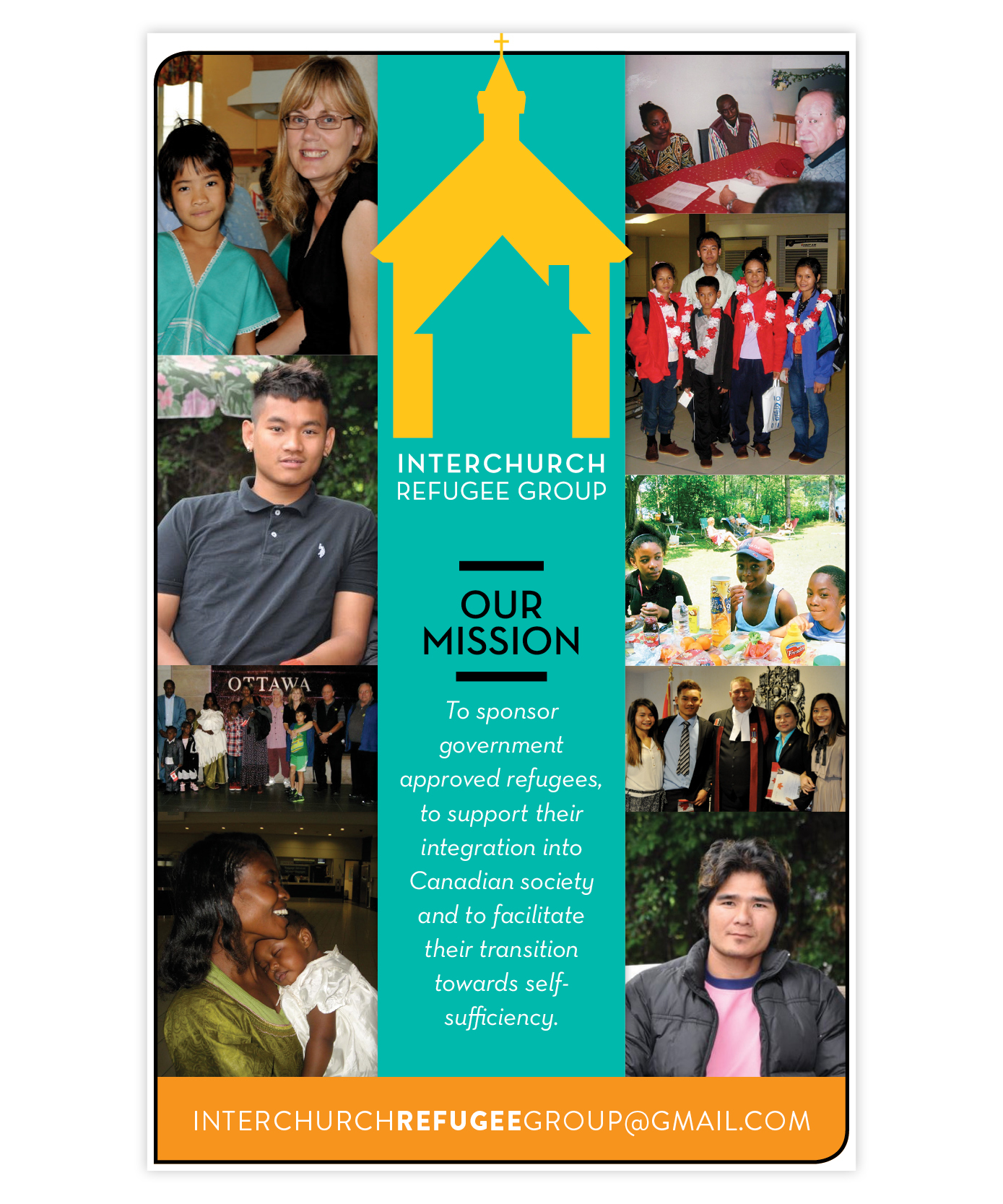
the concept of the logo came from the idea that there is always a safe place within the church- somewhere people can call home. the flat illustration style is on trend with current design, inspired by the 2D digital world. the orangey/yellow colour was used to mimic sunshine and show the refugee group as a happy, warm and hopeful place.
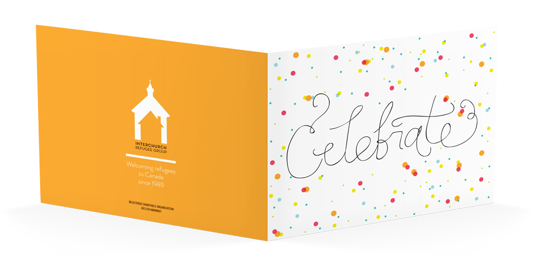
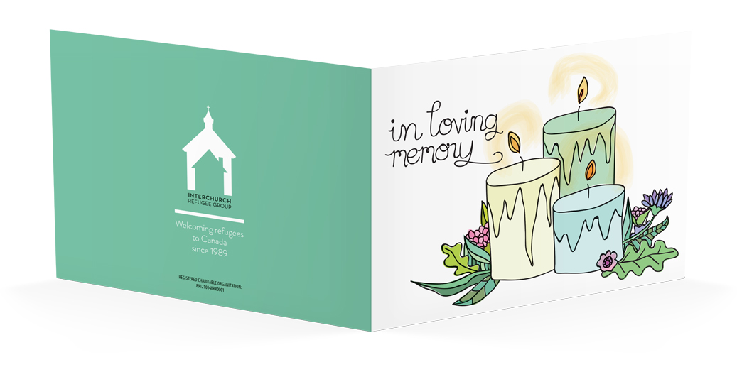
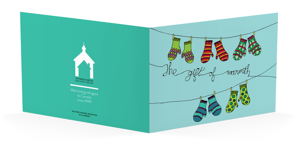
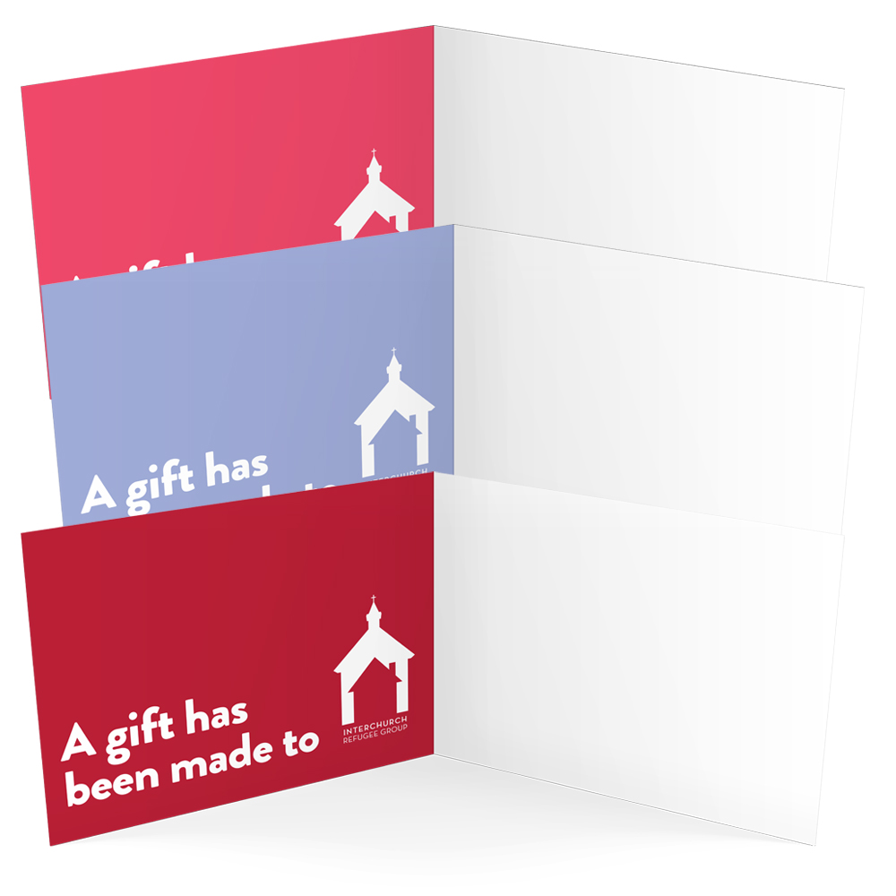
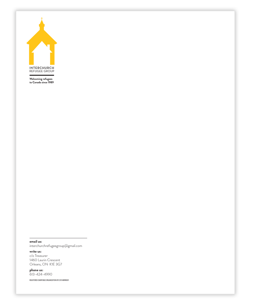
once the identity was done, it was rolled out into collateral like stationery and posters. afterwards, i made some special occasion & holiday cards that can be purchased in any amount as a donation, in lieu of a gift.