Archive

Tag Archives: handlettering

a second set of the tragically hip tickets went on sale yesterday at 10 am, and i tried to buy,  with no luck. #sadcanadian

since no one will sell me a ticket, i spent some time unleashing my sadness with a pencil, then took to adobe illustator, to complete my lettering.

wheat kings is one of my fave songs by the hip, so i’m sharing the backdrop with you!

enjoy.
xo.

download phone backdrop: 1080 x 1920
download screen backdrop: 2560 x 1440

lauraweatherston_wheatkings_mockup


if there is one thing i am really proud of, and i mean by a lot, it is that i am canadian. there’s so much of canada that i’ve yet to discover, but i’m already so in love this place. it is home; in all senses of the word.

when i started following along with the news of the fires in fort mac, alberta, so many people were already displaced. they may have had to leave their brick and mortar homes, but canada is still their home; and canada is full of friendly neighbours. in a matter of days, canadians had donated more than $50 million dollars to canadian red cross, with the government matching all individual donations. i’ve seen the screens in the subway stations here in toronto advertising ways to text in your donations. it’s everywhere, and people are taking part.

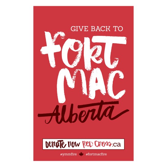
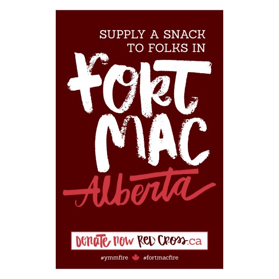
without a pocket full of cash to send out to alberta, i’ve come up with a miniseries of 3 posters that can be printed and posted to try and rally more donations. might be nothing, but if they get even one person to donate a canadian loonie or toonie, it’s something.

happy sharing.
#albertastrong

lauraweatherston_fortmac3

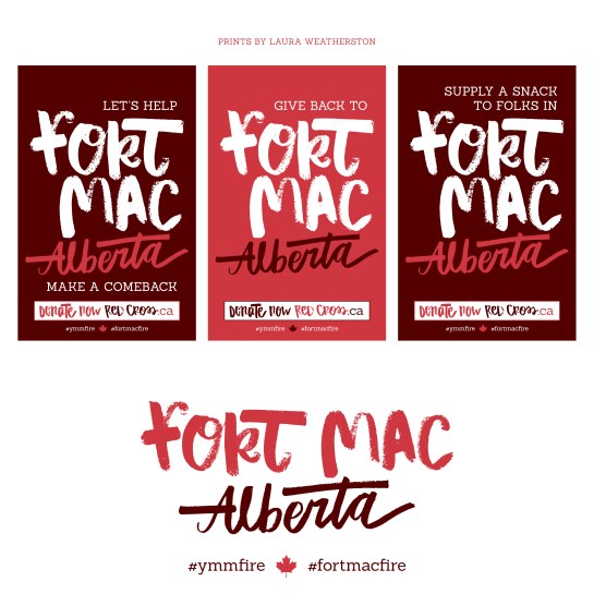
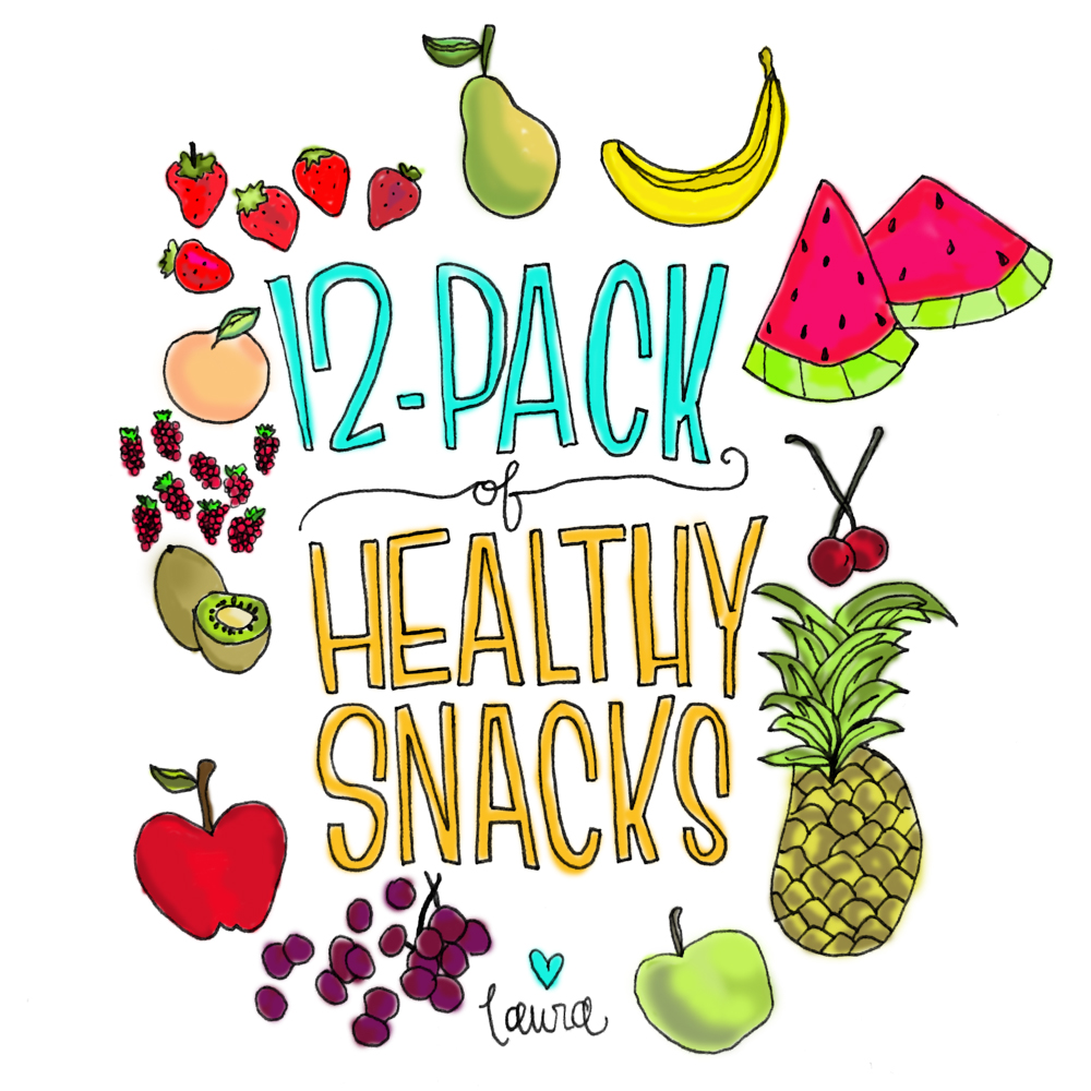
download lauraweatherston_fortmac-comeback|  download lauraweatherston_giveback-fortmac |  download lauraweatherston_supplyasnack-fortmac
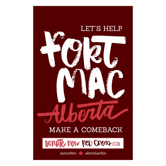
lauraweatherston_fortmac-comeback

lauraweatherston_giveback-fortmac

lauraweatherston_supplyasnack-fortmac

in 2014 i was hired pro-bono, by the interchurch refugee group to create an identity for them, in celebration of their 20th year as a not-for-profit organization. the brief was simple- an image so easy to understand, it didn’t require words.

the concept of the logo came from the idea that there is always a safe place within the church- somewhere people can call home. the flat illustration style is on trend with current design, inspired by the 2D digital world. the orangey/yellow colour was used to mimic sunshine and show the refugee group as a happy, warm and hopeful place.

once the identity was done, it was rolled out into collateral like stationery and posters. afterwards, i made some special occasion & holiday cards that can be purchased in any amount as a donation, in lieu of a gift.

love, laura

interchurch refugee group logo branding by laura weatherston
celebrate card by interchurch refugee group by laura weatherston
in loving memory card for interchurch refugee group by laura weatherston
christmas card for interchurch refugee group by laura weatherston
interchurch refugee group inside of cards
interchurch refugee group poster by laura weatherston
interchurch refugee group letterhead by laura weatherston

another tuesday, another 12-pack. still not beer, but just as refreshing.

summer is here and that means all the tasty fruits are ripe for the picking! today i’ve illustrated 12 of my favourite fruits to snack on in the summer. sketched out in ink, photoshopped in the colour with the brush tool, and bam- an assortment of colourful treats.

enjoy!
love, laura
12-pack of healthy snacks illustration by laura weatherston

hello spring!

with mother’s day coming up this weekend, it was the perfect time for trove to send out their 2015 spring lookbook. take a peek at some of the spring goodies they have in store and check out any one of their three locations here in toronto.

to mix it up this season, i’ve added some of my handlettering into the design.

happy spring and happy mothers day to all the mamas out there!

xo.
laura.

my cousin kaitlin is getting married this september and she asked me to do the design work for her big day. she came to me for something hand-lettered, fun and floral. she knew she wanted to work the colour navy into the design, but everything else was pretty much decided as we went.

step 1 was hand-lettering, and lots of it. i always start my sketching with a black ink pen in my sketchbook, then photograph the sketch with my iPhone, send it to myself and photoshop the sketch. once i clean it up to my liking, i take it in to illustrator and make it a vector image so it’s scaleable. from here, it’s time to play with colour, layout and adding actual fonts to get the design down.

below are just some of the doodles i worked on while sketching out the concept. stay tuned to see the final product.

laura.

kaitlin + jason monogram
kaitlin + jason
kaitlin + jason
kaitlin + jason
kaitlin + jason
kaitlin + jason
kaitlin + jason
kaitlin + jason