Archive

Tag Archives: lettering

a second set of the tragically hip tickets went on sale yesterday at 10 am, and i tried to buy,  with no luck. #sadcanadian

since no one will sell me a ticket, i spent some time unleashing my sadness with a pencil, then took to adobe illustator, to complete my lettering.

wheat kings is one of my fave songs by the hip, so i’m sharing the backdrop with you!

enjoy.
xo.

download phone backdrop: 1080 x 1920
download screen backdrop: 2560 x 1440

lauraweatherston_wheatkings_mockup


in 2014 i was hired pro-bono, by the interchurch refugee group to create an identity for them, in celebration of their 20th year as a not-for-profit organization. the brief was simple- an image so easy to understand, it didn’t require words.

the concept of the logo came from the idea that there is always a safe place within the church- somewhere people can call home. the flat illustration style is on trend with current design, inspired by the 2D digital world. the orangey/yellow colour was used to mimic sunshine and show the refugee group as a happy, warm and hopeful place.

once the identity was done, it was rolled out into collateral like stationery and posters. afterwards, i made some special occasion & holiday cards that can be purchased in any amount as a donation, in lieu of a gift.

love, laura

interchurch refugee group logo branding by laura weatherston
celebrate card by interchurch refugee group by laura weatherston
in loving memory card for interchurch refugee group by laura weatherston
christmas card for interchurch refugee group by laura weatherston
interchurch refugee group inside of cards
interchurch refugee group poster by laura weatherston
interchurch refugee group letterhead by laura weatherston

turns out i missed the memo on spring cleaning for 2015, so a summer tidy it is; and that includes technology. looking back, i found some of my iphone photos from my cousin kaitlin’s wedding last september, so here they are.

this was a really fun project for me, because i loved kaitlin’s vision right off the bat- her colour palette, vibe, and her desire for some illustration and hand-lettering had me sold.

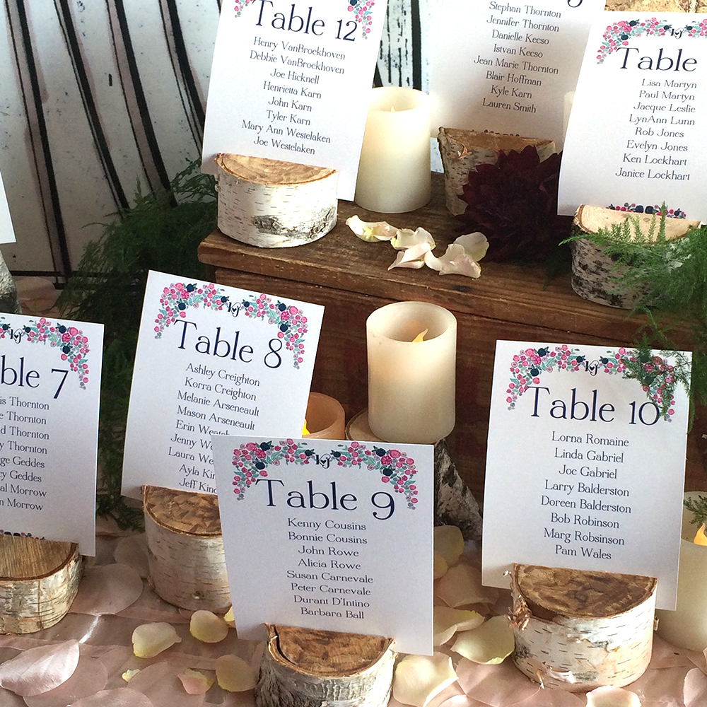
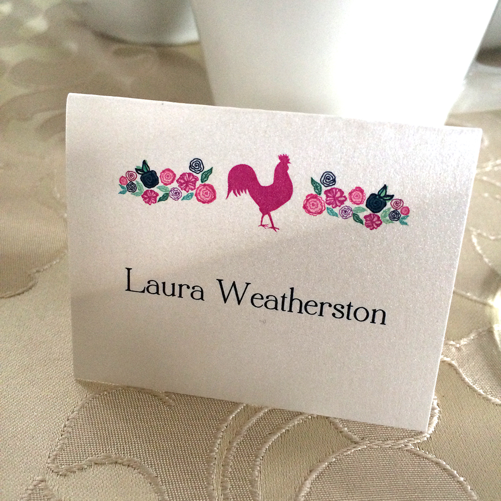
we thought through every detail for the designs. i made three placecard templates so kaitlin could input the names at her end. we had an icon for each of the dinner options: a chicken, if that was your order, a cow for beef, and one with a carrot for the vegetarians.

my design got to touch some really cool pieces:
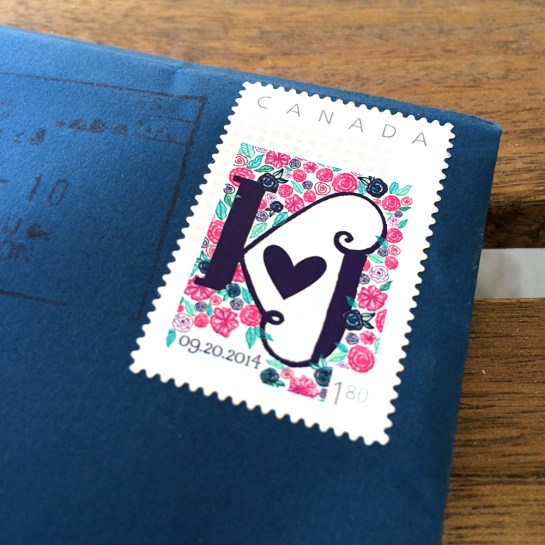
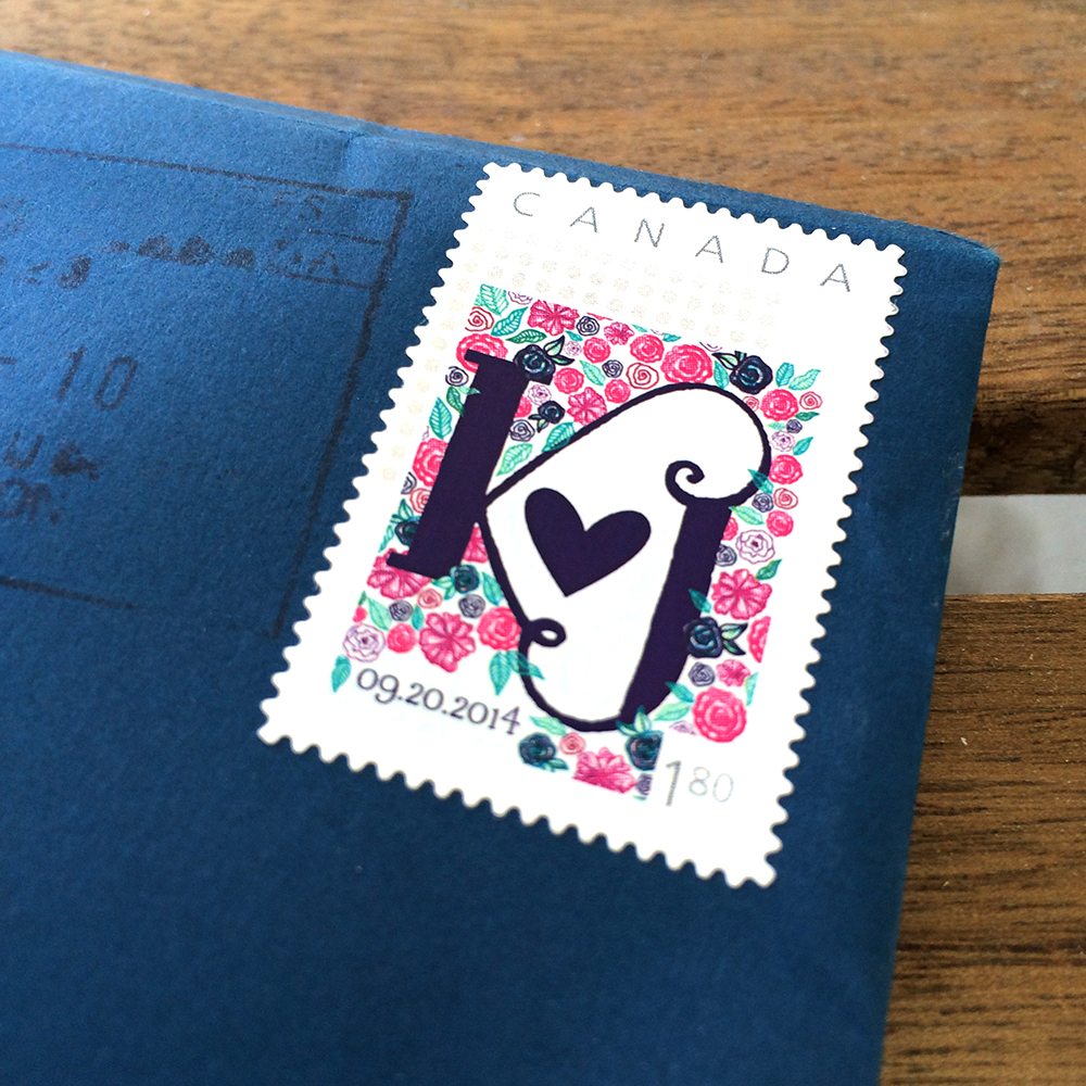
– custom-designed stamps for the invitations printed through canada post
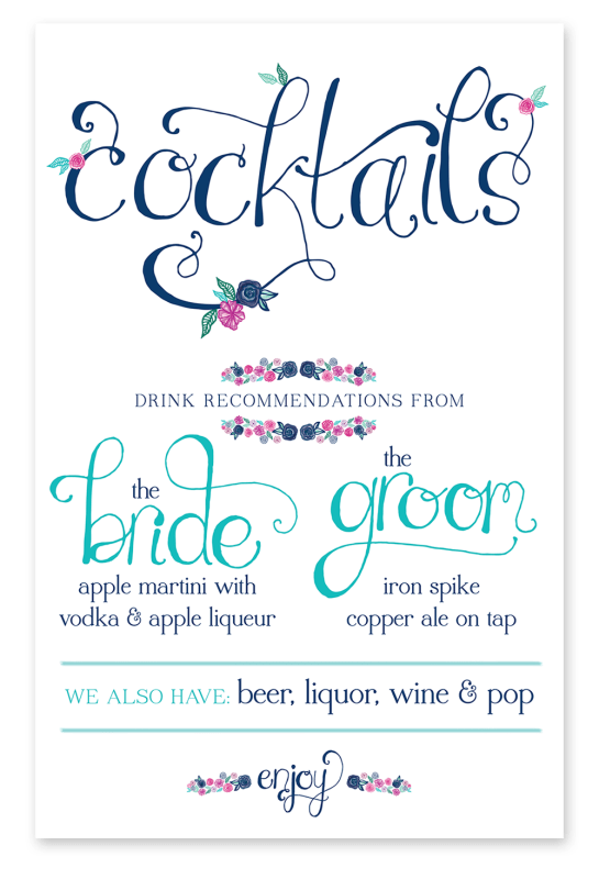
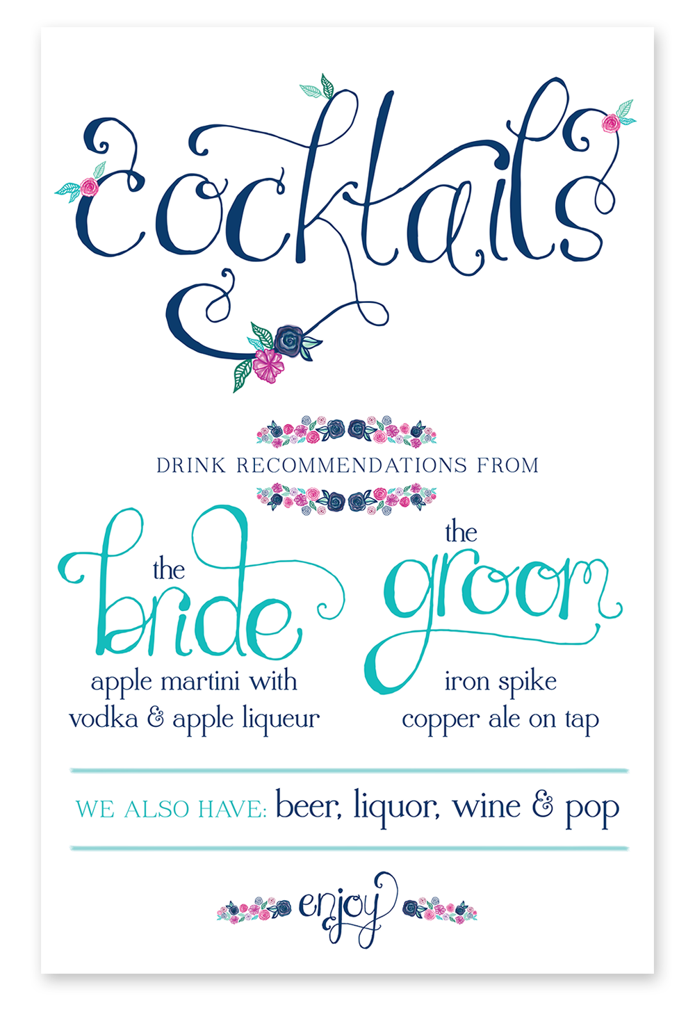
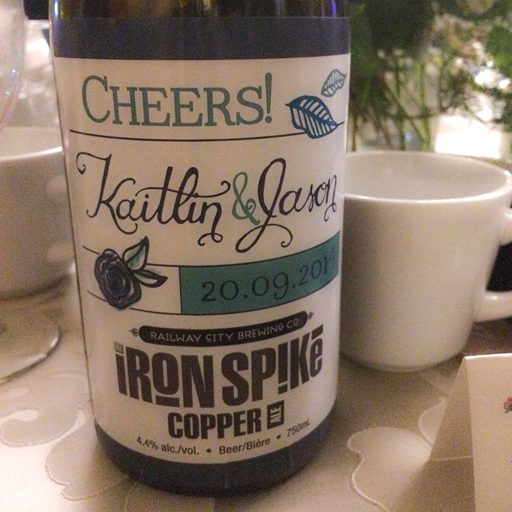
– my lettering & illustrations were used on the railway city brewing co. iron spike copper ale we drank at the reception
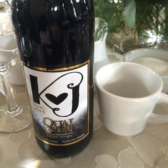
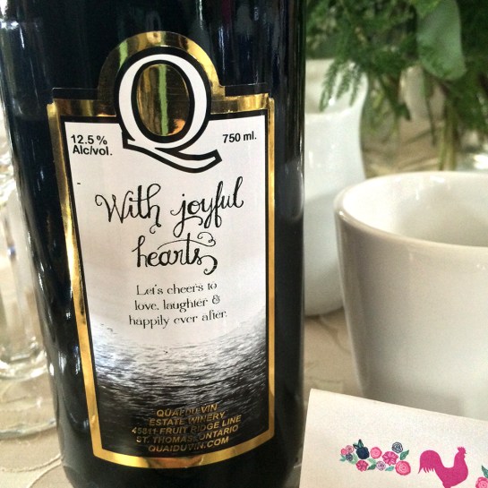
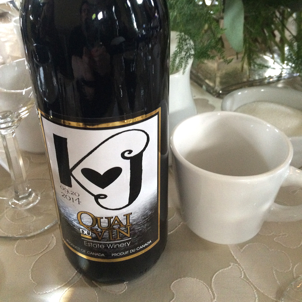
– customizing the wine labels for the quai du vin wine that was served

about some of the other pieces:
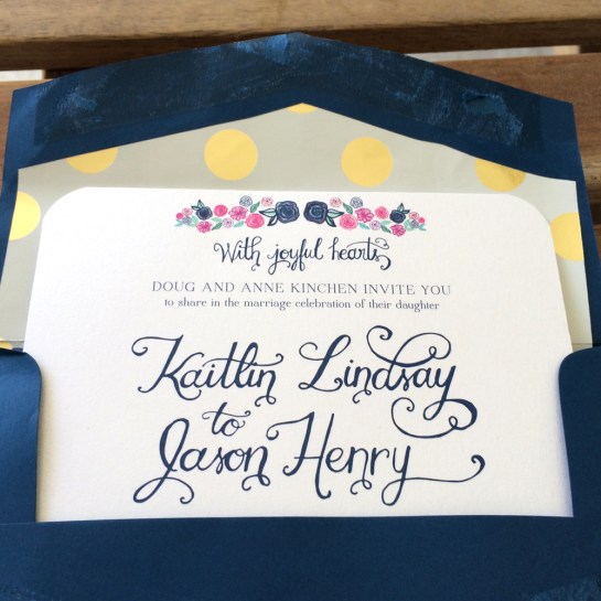
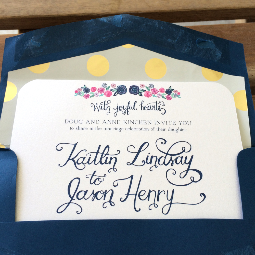
– kaitlin ordered all the paper and envelopes online from envelopments (positive experience!)
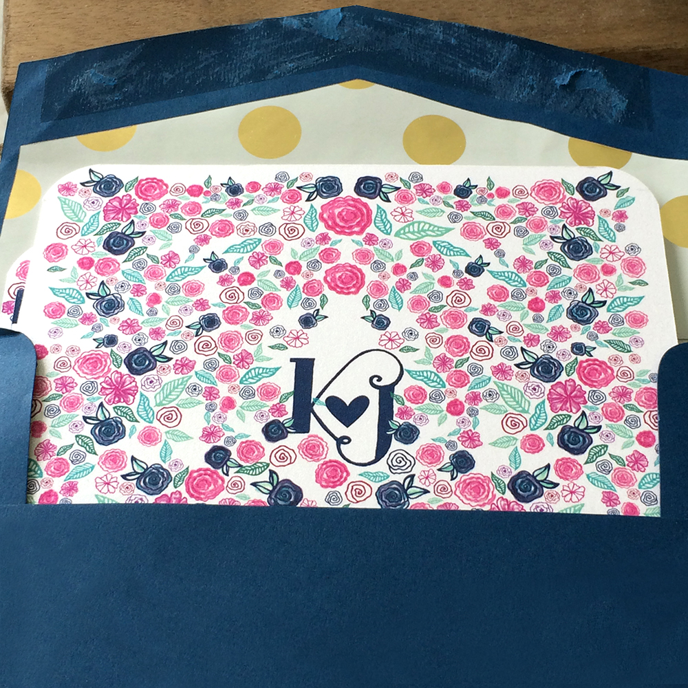
– the envelope liner is cut up wrapping paper she bought at homesense

check out some of my pics below.
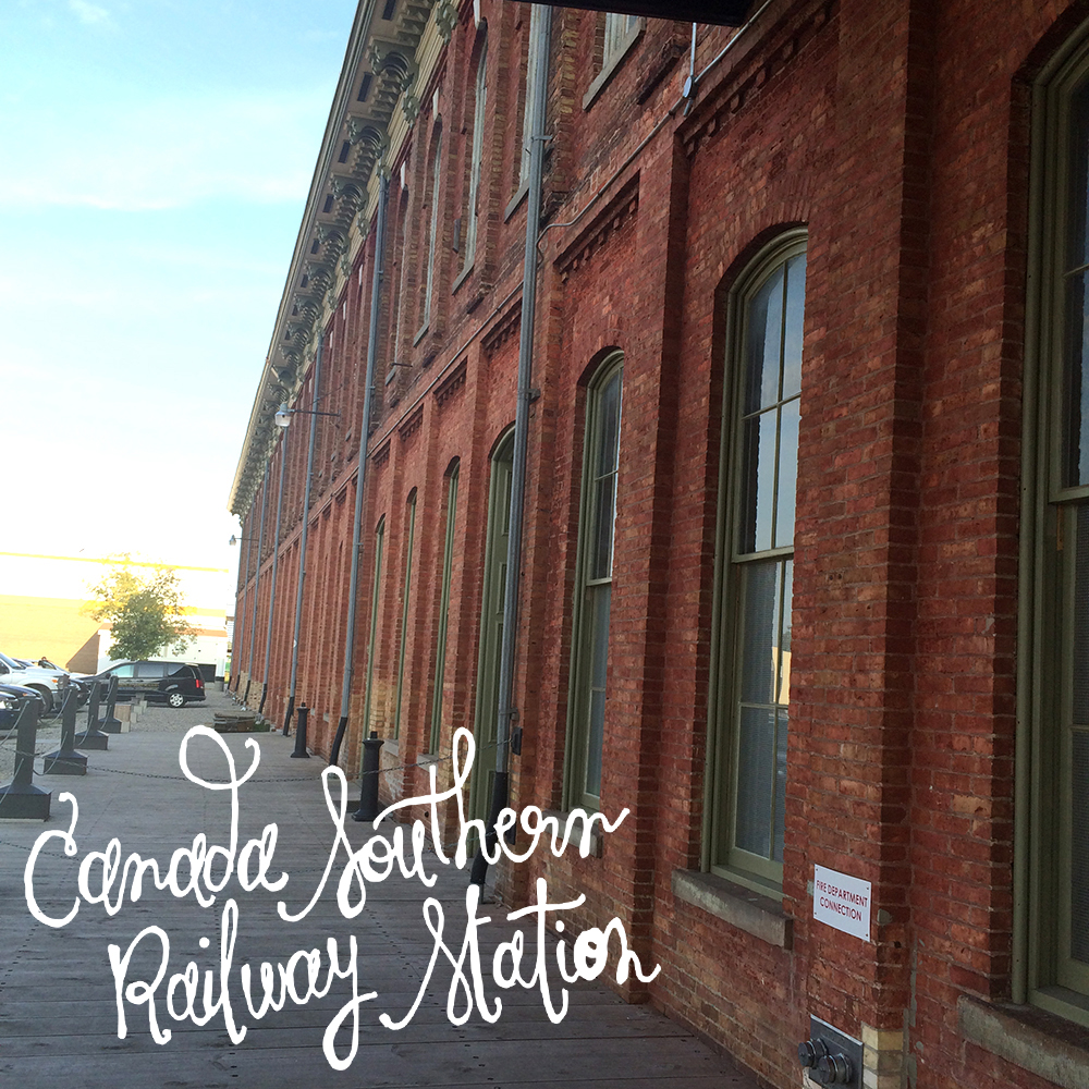
choo choo!

love, laura

stamp design
back of invitationopening invitation
Canada Southern Railway Station
finding your table.
place setting.
floral arrangement
kaitlin+jason cocktail menu by laura weatherston
Railway City Beer
Quai du Vin wine
Quai du Vin wine